![[Valid RSS]](/images/valid-rss-rogers.png "Validate my RSS feed")
Working with Core Plot
For fun, I’ve been rewriting an app I had created on iOS for measuring push notification performance. The original was written in Objective-C (Obj-C), but the rewrite is in Swift. The application uses Core Plot for visualizing, and much of my work so far has focused on getting the plots to look and work right. Revisiting my code brought back memories of the difficulties I encountered getting desired behavior out of the complex library (the generated documentation helps somewhat as do the demo apps, but I often need to dive into Core Plot code to get the desired behavior) this in another post).
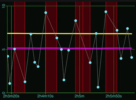
Below is the main view of my app. The top graph shows the relative times when a notification arrives at the device (X axis) and the amount of latency – known or calculated – between the sending of the notification and its arrival.
There are actually four plots in the upper view:
- Scatter plot of latency values over time (light blue connected dots)
- Average latency value (plotted as yellow line)
- Median latency value (plotted as magenta line)
- Missing data (shown as shaded red regions)
I’ll walk through how each of these is displayed.
Graphing Environment Setup
The main element in the view is a CPTXYGraph instance. It defines much of the graphing environment, including the axis and grid lines. For the most part, default settings will get you going, but I’m going to describe what changes I made to get the effect I wanted.
First, the placement of the CPTXYGraph within the hosting view:
let graph = CPTXYGraph(frame: self.frame)
hostedGraph = graph

graph.backgroundColor = CPTColor.black().cgColor
graph.zPosition = 1_000

graph.paddingLeft = 0.0
graph.paddingRight = 0.0
graph.paddingTop = 0.0
graph.paddingBottom = 0.0

graph.plotAreaFrame?.masksToBorder = false;
graph.plotAreaFrame?.borderLineStyle = nil
graph.plotAreaFrame?.cornerRadius = 0.0
graph.plotAreaFrame?.paddingTop = 0.0
graph.plotAreaFrame?.paddingLeft = 22.0
graph.plotAreaFrame?.paddingBottom = 35.0
graph.plotAreaFrame?.paddingRight = 4.0
The padding… properties are offsets from the bounds of the hosting view. I’ve set them to zero (0.0) here in order to use all available space. Next, there is the plotAreaFrame property, which defines the rectangle around the plotting area. Note that this excludes the axis. Since I do not want the plotting area to overlap with the X and Y axis areas, I set their padding to 35.0 and 22.0 respectively, values I came up with by trial and error.
Next, we allocate a CPTXYPlotSpace and configure it. A plot space defines the transformation between plot values and display units in both X and Y. One can have more than one plot space to support multiple transforms, though in my graph I only use one.
let plotSpace = CPTXYPlotSpace()
graph.add(plotSpace)

plotSpace.allowsUserInteraction = true
PlotSpace.allowsMomentumX = true
plotSpace.xRange = CPTPlotRange(locationDecimal: 0.0, lengthDecimal: 100.0)
plotSpace.yRange = CPTPlotRange(locationDecimal: 0.0, lengthDecimal: 1.0)
The plot space also handles scrolling if enabled. This is done via the allowsUserInteraction property .
The allowsMomentumX property controls if scrolling momentum is in use. Momentum here means that scrolling will continue for a configurable amount of time after a finger movement
As mentioned, the plot space defines the coordinate transforms for the width and height of the graph. In the code above, I default them to some values which will at least show something even if there is no data to plot.
Axis Configuration
There are a veritable ton of properties one can tweak for an axis. Most of them are self-explanatory, but a few deserve some discussion.
x.labelOffset = -4.0
x.tickDirection = .negative
x.labelFormatter = BRHTimeFormatter()
By default, the tick labels for the X axis hang down quite a bit. I bring them closer to the axis by setting a negative offset value for labelOffset. Next, I have the ticks pointing down from the axis line instead of up by setting tickDirection to .negative. Finally, one can install a label generator. The class BRHTimeFormatter converts X values into time labels like 3m35s.
For the Y axis, much of the setup is similar, though there are a few options specific to its vertical nature.
y.labelRotation = CGFloat(M_PI_2)
y.axisConstraints = CPTConstraints(lowerOffset: 0.0)
I rotate the labels by 90° with labelRotation in order to minimize amount of margin I need for larger latency values. I also set axisConstraints to constrain the Y axis so that it is always drawn at the left hand of the plot, regardless of any scrolling in X. Remove this setting and one will have a Y axis that scrolls with the plots.
There are some additional settings involving grid lines and tick marks, but these are not very interesting – look at the code if curious.
Once the plot space is setup, we next create the four plots. The order in which they are added to the graph will determine the order in which they are drawn – a plot added after another will draw over anything drawn by previously-added plots.
Missing Data Plot
The missing data plot shows where gaps are in the timeline where a value was expected but did not arrive. We depict such gaps with a red rectangle, filled with a translucent red to reduce its intensity:
let plot = CPTScatterPlot()
plot.identifier = GraphLatencyByTime.kMissingPlotId
plot.dataSource = self
plot.cachePrecision = .double
let lineStyle = CPTMutableLineStyle()
lineStyle.lineJoin = .round
lineStyle.lineCap = .round
lineStyle.lineWidth = 1.0
lineStyle.lineColor = CPTColor.red()
plot.dataLineStyle = lineStyle
plot.areaBaseValue = 0.0
plot.areaFill = CPTFill(color: CPTColor.red().withAlphaComponent(0.25))
graph.add(plot, to: plotSpace)
Each plot has a unique identifier property. We will use these to select the right data for generating the plot, and to allow the user to selectively show/hide the plot by tapping on the plot’s legend entry. The rest of the configuration is pretty normal. Again, we use a small alpha for the area fill so as to not overwhelm the graph with the regions.
Median and Average Latency Line Plots
The median plot shows the historical median latency value. It is configured as expected for a line plot.
let plot = CPTScatterPlot()
plot.identifier = GraphLatencyByTime.kMedianPlotId
plot.dataSource = self
plot.cachePrecision = .double
let lineStyle = CPTMutableLineStyle()
lineStyle.lineJoin = .round
lineStyle.lineCap = .round
lineStyle.lineWidth = 3.0
lineStyle.lineColor = CPTColor.magenta()
plot.dataLineStyle = lineStyle
graph.add(plot, to: plotSpace)
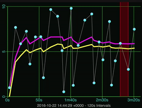
The average plot is the same except for the line color – yellow instead of magenta. The average value that is plotted represents a running average over all of the received values, while the median value is the middle value of a sliding window over the last N received values.
Latency Scatter Plot
For the last plot, we want to show the sample values as light blue dots, with thin gray lines connecting them.
let plot = CPTScatterPlot()
plot.identifier = GraphLatencyByTime.kLatencyPlotId
plot.dataSource = self
plot.cachePrecision = .double
let lineStyle = CPTMutableLineStyle()
lineStyle.lineJoin = .round
lineStyle.lineCap = .round
lineStyle.lineWidth = 1.0
lineStyle.lineColor = CPTColor.gray()
plot.dataLineStyle = lineStyle
let symbolGradient = CPTGradient(beginning: CPTColor(componentRed: 0.75, green: 0.75, blue: 1.0, alpha: 1.0), ending: CPTColor.cyan())
symbolGradient.gradientType = .radial
symbolGradient.startAnchor = CGPoint(x: 0.25, y: 0.75)
let plotSymbol = CPTPlotSymbol.ellipse()
plotSymbol.fill = CPTFill(gradient: symbolGradient)
plotSymbol.lineStyle = nil;
plotSymbol.size = CGSize(width: kPlotSymbolSize, height: kPlotSymbolSize)
plot.plotSymbol = plotSymbol;
plot.plotSymbolMarginForHitDetection = CGFloat(kPlotSymbolSize) * CGFloat(1.5)
graph.add(plot, to: plotSpace)
As before we define the line style, but we also define a symbol to show. Here, we use a gradient to color the circular symbol. We also set plotSymbolMarginForHitDetection with a larger size than the symbol size to make touching the symbol easier. Touching the symbol shows the actual sample value.
Graph Legend

Core Plot will draw a legend that shows plot indicators (color line and/or symbols) and a name. Note that the order of the components in the legend are in the same order as how the plots were added to the graph. Here’s the setup code that configures the legend:
let legend = CPTLegend(graph: graph)
graph.legend = legend
graph.legendAnchor = .top
graph.legendDisplacement = CGPoint(x: 0.0, y: -5.0)
legend.isHidden = true
legend.fill = CPTFill(color: CPTColor.darkGray().withAlphaComponent(0.5))
let titleStyle = CPTMutableTextStyle()
titleStyle.color = CPTColor(genericGray: 0.75)
titleStyle.fontSize = 11.0
legend.textStyle = titleStyle;
let lineStyle = CPTMutableLineStyle()
lineStyle.lineWidth = 0.75
lineStyle.lineColor = CPTColor(genericGray: 0.45)
legend.borderLineStyle = lineStyle
legend.cornerRadius = 5.0
legend.swatchSize = CGSize(width: 25.0, height: 25.0)
legend.numberOfRows = 1
legend.delegate = self
let recognizer = UITapGestureRecognizer(target: self, action: #selector(handleTap))
recognizer.numberOfTouchesRequired = 1
recognizer.numberOfTapsRequired = 2
self.addGestureRecognizer(recognizer)
The legend will appear at the top of the graph, but it is initially hidden. A custom UITabGestureRecognizer will toggle legend visibility when the user taps twice on the graph. Setting the legend’s delegate property will allow us to toggle visibility of individual plots when a legend component is tapped. Here are the methods that control visibility, first for the legend as a whole, and then for individual plots:
func handleTap(recognizer: UITapGestureRecognizer) {
    guard let legend = self.hostedGraph?.legend else { return }
    legend.isHidden = !legend.isHidden
}
func legend(_ legend: CPTLegend, legendEntryFor plot: CPTPlot, wasSelectedAt idx: UInt) {
    plot.isHidden = !plot.isHidden
}
Auto-Scaling in Y
When a new data sample arrives or when the user scrolls the graph in the X direction, I wanted the graph to update the Y axis to always have the max value in the view as the max value of the Y axis (plus some padding). To accomplish this, I first obtain the view values of the X axis in plot space units (seconds), and then query the data source for the min/max sample values that fall between the two times.
fileprivate func updateYRange() {
    guard let plotSpace = hostedGraph?.allPlotSpaces().last as? CPTXYPlotSpace else { return }
    guard let axisSet = hostedGraph?.axisSet as? CPTXYAxisSet else { return }
    guard let x = axisSet.xAxis else { return }
    guard let y = axisSet.yAxis else { return }
    let xRange = plotSpace.xRange
    let yMinMax = findMinMaxInRange(range: xRange) ?? (0.0, 10.0)
    let yMax = floor(yMinMax.max + 0.9)
    if targetYMax != yMax {
        targetYMax = yMax
        let yRange = CPTMutablePlotRange(location: NSNumber(value: 0.0), length: NSNumber(value: yMax))
        y.majorTickLocations = Set<NSNumber>([0, yMax / 2, yMax].map { NSNumber(value: $0) })
        y.visibleAxisRange = yRange
        y.visibleRange = yRange
        x.gridLinesRange = yRange
        yRange.expand(byFactor: 1.05)
        let oldRange = plotSpace.yRange
        CPTAnimation.animate(plotSpace, property: "yRange", from: oldRange, to: yRange, duration: 0.25)
    }
    y.gridLinesRange = xRange
}
The findMinMaxInRange method will return the min/max Y values for the currently display X range. We then round up the max value to the nearest whole value, and if it is not the same as the last max value, we update the graph and Y axis so it will show the new Y range.
private func findFirstSampleAtOrBefore(when: TimeInterval) -> Int {
    let pos = source.samples.map({$0.arrivalTime}).insertionIndexOf(value: source.startTime.addingTimeInterval(when),
                                                                    predicate: {$0 < $1})
    return pos
}

private func findMinMaxInRange(range: CPTPlotRange) -> (min: Double, max: Double)? {
    if source.samples.count == 0 { return nil }
    let x0 = findFirstSampleAtOrBefore(when: range.locationDouble)
    let x1 = findFirstSampleAtOrBefore(when: range.endDouble)
    return source.samples[x0..<x1].map({$0.latency}).minMax()
}
The findMinMaxInRange functionality relies on two extensions to Collection types with Comparable elements. First, is the method insertionIndexOf(value:,predicate:) which will return the index in a collection where inserting a given value would keep the collection in an ordered state (see Adding Binary Search to Swift Collections for specifics). This is used by the findFirstSampleAtOrBefore(when:) method. The second extension to Collection is a minMax method that returns a 2-tuple containing both the min and max values within a collection or a slice of one.
To auto-scale during scrolling, I implemented the plotSpace(space:,didChangePlotRangeFor:) method of the CPTPlotpaceDelegate protocol. Here, I discard any changes that make the X or Y axis min deviate from 0.0, and when the X axis changes, I call updateYRange().
extension GraphLatencyByTime: CPTPlotSpaceDelegate {
    func plotSpace(_ space: CPTPlotSpace, didChangePlotRangeFor coordinate: CPTCoordinate) {
        guard let plotSpace = space as? CPTXYPlotSpace else { return }
        switch coordinate {
        case .Y:
            let yRange = plotSpace.yRange
            if yRange.locationDouble != 0.0 {
                plotSpace.yRange = CPTPlotRange(location: NSNumber(value: 0.0), length: yRange.length)
            }
        case .X:
            let xRange = plotSpace.xRange
            if xRange.locationDouble < 0.0 {
                plotSpace.xRange = CPTPlotRange(location: NSNumber(value: 0.0), length: xRange.length)
            }
            updateYRange()
        default: break
        }
    }
}
Auto-Scrolling X
If the user has not manually scrolled the graph to some point in the past, I want the graph to always show new samples when they arrive. Arrival of new samples cause an iOS Notification event which the graph listens for. It is processed in the sampleAdded(notification:) routine:
func sampleAdded(notification: Notification) {
    let info = RunDataNewSampleNotification(notification: notification)
    guard let plots = hostedGraph?.allPlots() else { return }
    plots.forEach {
        if $0.identifier === GraphLatencyByTime.kMissingPlotId {
            if info.sample.missingCount > 0 {
                let numRecords = info.sample.missingCount * 2 + 1
                $0.insertData(at: UInt(source.missing.count - numRecords), numberOfRecords: UInt(numRecords))
            }
        }
        else {
            $0.insertData(at: UInt(info.index), numberOfRecords: 1)
        }
    }
    if Thread.isMainThread {
        updateBounds()
    }
    else {
        DispatchQueue.main.async(execute: self.updateBounds)
    }
First, each plot’s insertData method is called with the number of new records to add to the plot. the “missing samples” plot adds 2N + 1 records for N missing samples, since the plot shows a very tall rectangle for each missing sample. Next, I update the plot bounds (both X and Y) with a call to updateBounds. Since the notification may arrive in a thread other than the main UI one, we make sure that updateBounds runs only on the main UI thread.
The scrolling takes place in the following snippet from updateBounds:
else if plotData.count > 1 && xValueFor(sample:plotData[plotData.count - 2]) < plotSpace.xRange.endDouble {
    let oldRange = plotSpace.xRange
    let newRange = CPTMutablePlotRange(location: NSNumber(value: xMin), length: NSNumber(value: xMax - xMin))
    newRange.expand(byFactor: 1.05)
    CPTAnimation.animate(plotSpace, property: "xRange", from: oldRange, to: newRange, duration: 0.25)
}
Here we look to see if the the previous point is visible, and if so, we adjust the X range to show the new point, animating the transition from the old X range to the new one.